Cliu BioAnimation Studio is founded on the idea that basic biology should be engaging and accessible to everyone.
Watch the video to see this philosophy in action!
Part of my work focuses on bringing the wonder and awe of basic biomedical research and the discovery process to a wider audience.
The other part of my work involves working with clients directly to create animations and illustrations tailored to their particular need and budget.
I work across the entire video production pipeline, from scripting and storyboarding thru production and integration into the end platform. Visit the “Let’s Work Together” section at the end of this page to start your project with me!
I am constantly exploring and experimenting with more engaging ways of presenting biomedical topics visually.
This page displays some samples of my work, and is updated frequently!
Fluorescence Activated Cell Sorting - an animated loop for a classroom curriculum
Fluorescence Activated Cell Sorting (FACS) is a foundational technique used in immunology research to separate a mixture of cells into pure cellular populations based on properties that are unique to each cell type.
I recently created this looping animation for Dr. Richard Cross, Director of the Immunology Flow Cytometry core at St. Jude Children’s Research Hospital as a teaching tool to show students and trainees the inner workings of a FACS instrument.
What types of instrumentations and core techniques do you use in your field? How would you use animations to introduce learners to these tools and techniques to help them prepare for working in the laboratory?
Animating for Conference Presentation at EUROMIT 2026
Using animations to summarize a phenotype or mechanism can be a powerful way to communicate your research to your audience. Dynamic visuals that are aligned and focused to your message helps your audience see and hear your message simultaneously, enabling more rapid understanding and enhancing memorability. An aesthetic visual inspires curiosity as well, encouraging viewers to want to learn more, engage in discussions, which can further enlighten the investigators on which future avenues of research may be the most fruitful to prioritize.
This animation depicting a ballooning mitochondrial morphology resulting from loss of mitochondrial protein MIC60 was made to accompany a flash talk for first author Stephanie Rockfield, PhD at EUROMIT 2026. The animation was created using Blender, and based upon microscopy images and videos provided by Dr. Rockfield.
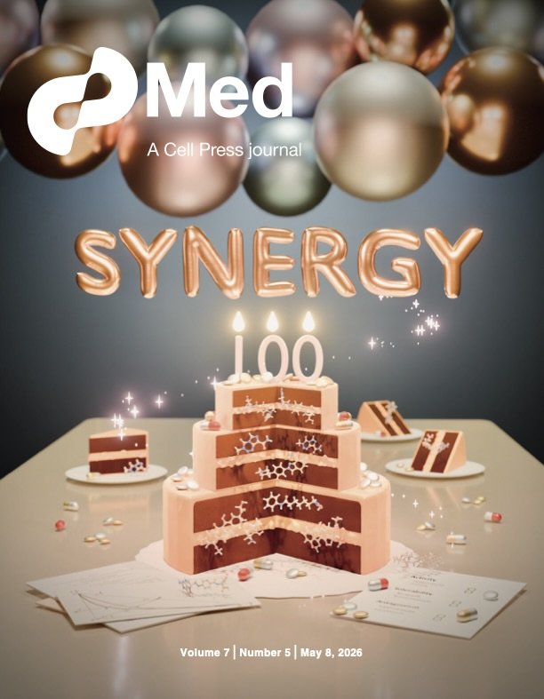
Med Journal Cover - selected for the May 2026 issue
Cover art for Meyer et al. “Rethinking the role of synergy calculations in the next century of drug combination discovery”
2026 marks 100 years since Siegfried Walter Loewe first proposed a mathematical framework for the drug synergy effect - a promising idea where the use of drug combinations may create synergistic therapeutic effects that surpass the additive efficacy of individual component drugs. However, in the century to come, the idea has proven to be more complicated to achieve in practice.
This artwork - featured on the cover of the Med journal, May 2026 issue, accompanies Meyer at el., a synthesis article that invites researchers and practitioners to re-evaluate efforts around optimizing for drug combination efficacy.
The layers of the cake represent 3 key interconnected observations described in the article, built upon clinical examples of successful (and failed) drug combinations, which are represented by the pills and chemical structures whose identity are listed on the placard at bottom right. Pills and chemical structures are also matched in each cake slice in the background. Tribute to Loewe’s seminal 1926 paper and central graph can be found at bottom left.
Animated Mechanism of Catnip
An animated abstract inspired by Uenoyama et al. “The characteristic response of domestic cats to plant iridoids allows them to gain chemical defense against mosquitoes.” Sci. Adv. 2021
This short was inspired by the research article by Uenoyama et al. where the authors found that Nepetalactol (C10 H16 O2), a natural mosquito repellant in catnip and silver vine, also triggers endorphin release in cats and other felines. When cats sense this compound, the mu-opioid receptors in the olfactory centers of their brain get triggered, followed by rubbing and rolling behavior that gets more insect repellant on their face and body, especially the areas around the eyes that have less fur and can be more sensitive to mosquito bites. Researchers think that evolutionarily, this response may help wild felines protect themselves against bug bites while hunting, since felines typically stalk their pray by crouching low to the ground and hiding in tall grasses that are laced with insects.
Oxygen Binding Kinetics of Hemoglobin in 3D
Re-imagining a textbook lesson.
Do you remember learning about the oxygen binding kinetics of hemoglobin as a still graph in the classroom and textbooks? What if we can see the oxygen molecules slide into a 3D hemoglobin as it travels the curve like a monorail?
This animation, made for a high school learning module, reimagines the oxygen binding curve of hemoglobin as a dynamic process. The adult hemoglobin protein structure is imported from Protein Data Bank (PDB 2H35), with each of the 4 oxygen molecules sliding into each Heme subunit as hemoglobin travels the signature sigmoidal curve of binding kinetics.
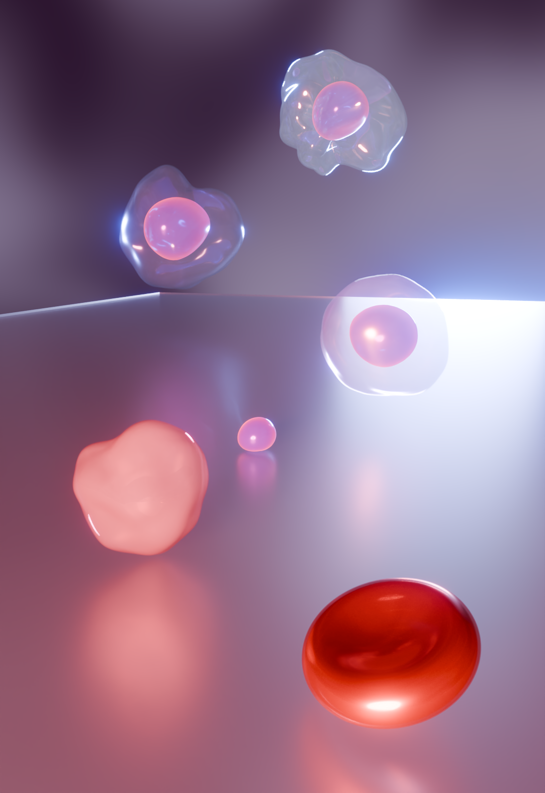
Erythrocyte maturation
An exploration into depth & perspective in conveying cellular maturation.
This 3D render shows 5 cells representing the 5 major stages of erythrocyte development, dropping onto a frosted glass slide. From top to bottom, they are hemocytoblast, proerythroblast, erythroblast, reticulocyte, and erythrocyte. Their proximity to the surface of the glass slide represent lineage commitment and a loss of self proliferative capacity, with the ejected nucleus of the reticulocyte being a pivotal determinant against proliferative capacity.
Clotting Cascade 2D animation
This 2D animation of the clotting cascade was custom built for a learning module, where independent 2D assets can be used to integrate with module software for an interactive learner experience.
Animated Preview for Biostatistics Software - lsBART
location smoothed Bayesian Additive Regression Trees
Biostatistics and data sciences critically contribute to both rigor and discovery in modern day biomedical research. Effective dissemination of biostatistical and data science tools help establish new collaborations and push the bounds of scientific and medical possibilities.
This motion-graphics based summary describes lsBART - a biostatistical software developed by St. Jude faculty Zachary Wooten, Ph.D., used for AI-assisted medical imaging analysis.
Zachary T Wooten et al. Location smoothed Bayesian additive regression trees: a method for interpretable and robust quality assurance of organ contours in radiotherapy treatment planning, Journal of the Royal Statistical Society Series C: Applied Statistics, Volume 74, Issue 5, December 2025, Pages 1301–1320, https://doi.org/10.1093/jrsssc/qlaf024
This, along with a series of 7 other biostatistical animated previews were built to enable easier understanding of recently developed biostatistical software.
“Caitlin was a huge help to me and my research group. She worked with us to create a beautifully detailed video that clearly explains some pretty complex AI modeling… that’s going to be key in helping us share this work more broadly …Her eye for design, attention to detail, and ability to bring clarity to technical content really made a difference.”
~ Zachary Wooten, PhD., Biostatistics Faculty
(St. Jude Children’s Research Hospital)
The full series of biostatistical software animation can be found on St. Jude Research Biostatistical Software page.
A note on process
For well-defined projects with immediate and specific use case, the final product can be delivered within 3 to 4 check-ins, at a rhythm of 2 - 7 days between check-ins, depending on the complexity of each visual build, revision, and the requester’s urgency.
An initial meeting following a client request generally establishes the aesthetics, scope, and timeline of the project. Once the project has started, I provide clients with progress updates every 2 - 7 business days. This frequency of check-ins ensure we remain on the same page and that client feedback is incorporated consistently as I build toward the final product.
Time to completion is project specific, and can be anywhere from 2 to 6 weeks from initial request to completion. Rush projects are possible, but may require refining the scope of the project to focus on immediate communication needs. In these cases, I work with clients to find alternative solutions to meet tight deadlines.
Let’s work together ~
To work with me, simply email Beiyun@cliubioanimation.studio with the following information:
Your name, email contact, and timezone
Brief project description
Relevant supporting material to help me better understand your vision - these can be project drafts, research papers, sample visuals, etc.
I generally respond within 2 business days with follow-up questions and to set up a virtual meeting to discuss project details.
My timezone is UTC-5.
Looking forward to connecting!