Journal cover art remains at the forefront of scholarly outlet to creatively celebrate the research and its publication, especially as it provides one of the few channels in which scientists are encouraged to dive into the artistic and aesthetic realm.
Furthermore, in recent years, many journals have started to take advantage of the digital platform to create animated artworks, enabling thought-provoking concepts to be further stylistically realized.
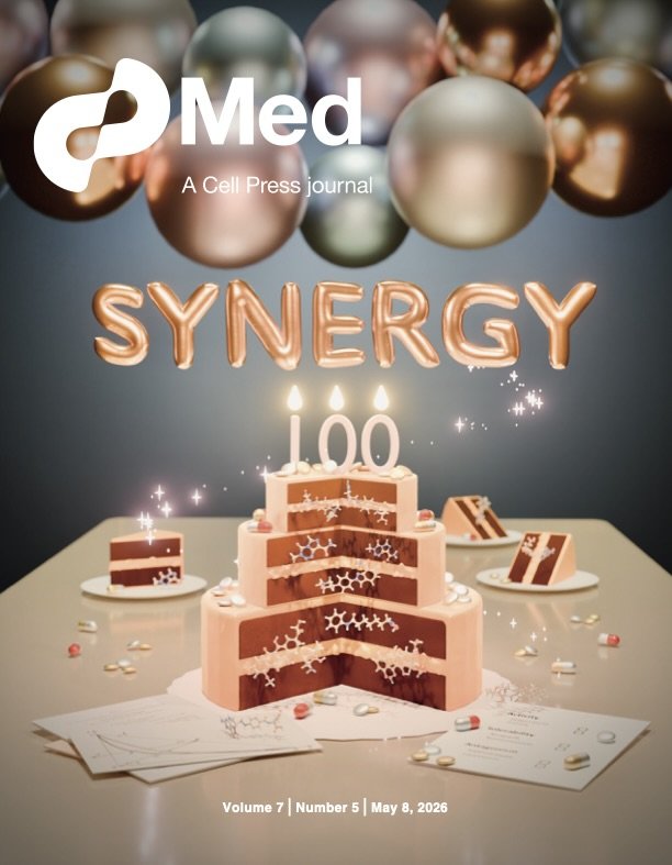
Med Journal Cover - selected for the May 2026 issue
Cover art for Meyer et al. “Rethinking the role of synergy calculations in the next century of drug combination discovery”
2026 marks 100 years since Siegfried Walter Loewe first proposed a mathematical framework for the drug synergy effect - a promising idea where the use of drug combinations may create synergistic therapeutic effects that surpass the additive efficacy of individual component drugs. However, in the century to come, the idea has proven to be more complicated to achieve in practice.
This artwork - featured on the cover of the Med journal, May 2026 issue, accompanies Meyer at el., a synthesis article that invites researchers and practitioners to re-evaluate efforts around optimizing for drug combination efficacy.
The layers of the cake represent 3 key interconnected observations described in the article, built upon clinical examples of successful (and failed) drug combinations, which are represented by the pills and chemical structures whose identity are listed on the placard at bottom right. Pills and chemical structures are also matched in each cake slice in the background. Tribute to Loewe’s seminal 1926 paper and central graph can be found at bottom left.
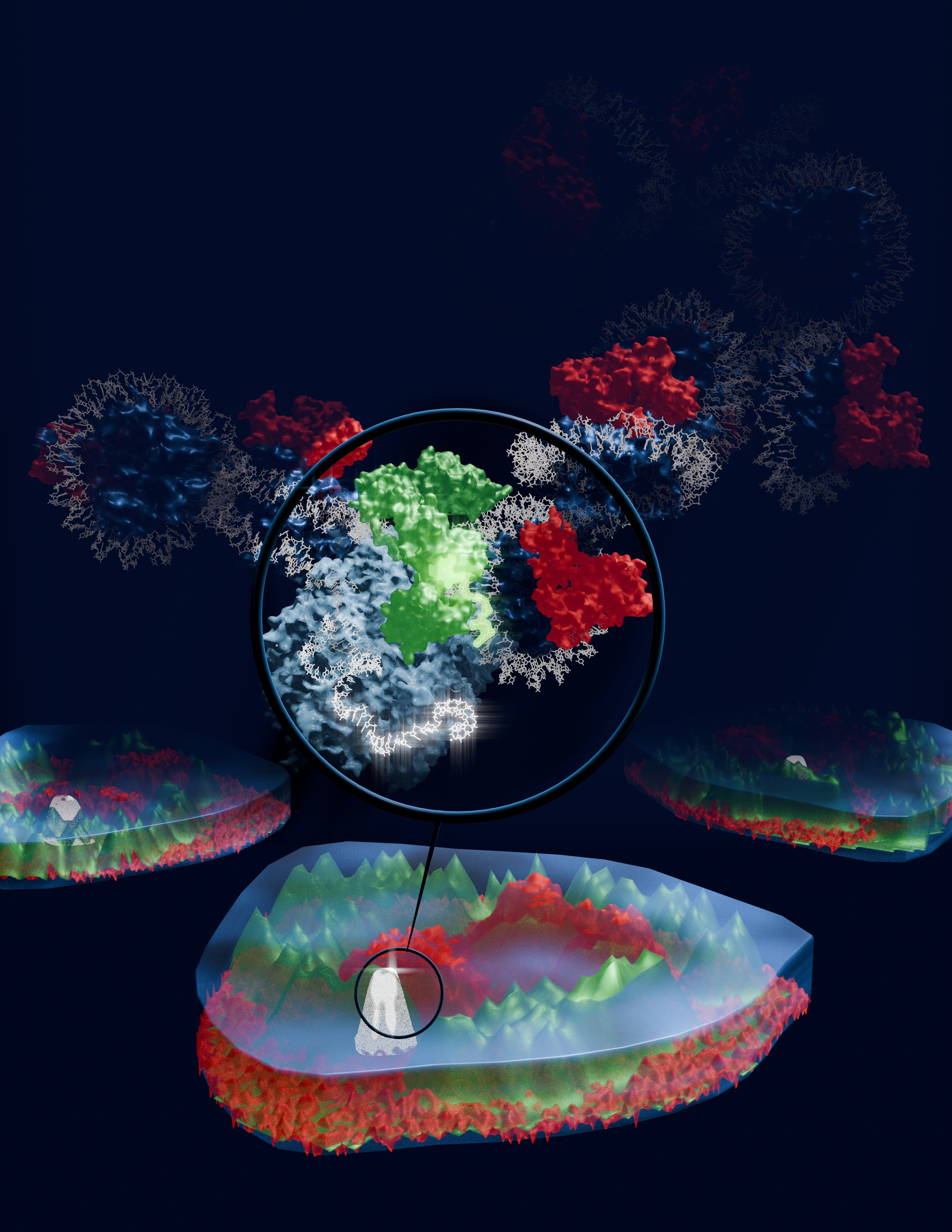
Cover Art - re-imagining signal colocalization as mountainous topology
Cover art submission for Brandon, C.J., Robinson-Thiewes, S., Kaulage, M. et al. BRD4 recruitment into HP1 condensates desilences transcription without erasure of repressive chromatin. Nat Cell Biol28, 1846–1856 (2026). https://doi.org/10.1038/s41556-026-02044-1
In this image, key microscopy findings of factor colocalizations are re-imagined as 3-dimensional signal topologies, with magnification showing the model of protein-protein interaction described in the manuscript.
Ultimately, Nature Cell Biology selected a microscopy image from another article of the same issue, inline with their normal cover preferences. However, the aesthetics for this image was based on the journal’s signature use of darker backgrounds with vibrant fluorescence-based colors. By strategically using color consistency, vibrancy, and contrast, this composition creates an illusion where the image “pops” out of the page, enhancing depth and dimensionality while drawing the viewer into the narrative flow between the stylized signal topology and the modeled molecular structure.
Anime Styled - Your Name (2016) Embryo Sequence
I am deeply inspired by traditional animations of Disney and Ghibli. In the 2016 animated film Your Name (2016) by Makoto Shinkai, a pivotal montage that changes the tone of the movie from playful to introspective starts with a stylized depiction of early embryo development.
In this practice, I attempted to capture the aesthetics and nostalgia of 2D anime using 3D techniques. Although not a perfect mimic of the anime, it was a fruitful exercise in pacing, scene structuring, and color composition.
Erythrocyte maturation
An exploration into depth & perspective in conveying cellular maturation.
In this scene, the stages of red blood cell, or erythrocyte development occupy positions according to their level of stemness and differentiation, with the mature erythrocyte sitting closest to the viewer, resting gently on the frosted glass slide.
Here, distance from the viewer and the frosted glass slide are used to convey a sense of developmental time and progression toward terminal differentiation.
The Hemocytoblast floats behind the Proerythroblast, and the Proerythroblast floats behind the Erythroblast. As each cell or developmental stage gets closer to us, the viewers, they also descend toward the glass slide, representing the progressive loss of stemness. Then, the Erythrocyte loses its nucleus during its transition to the Reticulocyte.
The ejected nucleus rests on the glass slide, representing a pivotal event that marks the beginning of terminal differentiation and the loss of self renewal capacity that characterize the last two stages - Reticulocyte and Erythrocyte, both of which rests on the glass slide to represent lineage commitment. Finally, we return to the erythrocyte, the most tangible in biological understanding, close enough for us to reach out and touch.
As we focus our attention on each cell stage, softly moving back and forth in this rendered 3D space, I hope the image brings you a sense of calm and gentle immersion.
Fluorescent Proteins light up Halloween
In the absence of an mPumpkin, mOrange will need to substitute in to light up our pumpkin string lights this Halloween!
This animated loop was a homage to my long-time love for the whimsically named mFruit series of orange-red fluorescent proteins.
🟧 mFruit series with light emission wavelengths in the orange spectrum
mHoneydew ~ dual peaks at 537nm & 562nm
mBanana ~ 551-553nm
mOrange ~ 560-562nm
🟧🟥 mFruit series with light emission wavelengths in the orange-red spectrum
dTomato ~ 581nm
mTangerine ~ 583-585nm
mApple ~ 592nm
mStrawberry ~ 595-597nm
mLychee ~ 596nm
🟥 mFruit series with light emission wavelengths in the red spectrum
mCherry ~ 610nm
mGrape ~ 610-620nm
mRaspberry ~ 620-625nm
mPlum ~ 648-649nm
All derived from the naturally fluorescent DsRed that gives the neon red glow of the Discosoma species of mushroom corals.
Electron Transport Chain in Fairytale Aesthetics
Have you ever noticed that every protein complex in the Electron Transport Chain resembles a storybook item?
This is the cover art for a series where I blend fairytale based storytelling with the mechanisms of how electrons flow through each component of the Electron Transport Chain. The full series combine voice over, relaxing soundscape, the characters from beloved childhood tales as we follow the electrons from one complex to the next. You can find the full series on my Instagram account - Storify Biology.
A note on process
For well-defined projects with immediate and specific use case, the final product can be delivered within 3 to 4 check-ins, at a rhythm of 2 - 5 days between check-ins, depending on the complexity of each visual build, revision, and the requester’s urgency.
An initial meeting following a client request generally establishes the aesthetics, scope, and timeline of the project. Once the project has started, I provide clients with progress updates every 2 - 5 business days. This frequency of check-ins ensure we remain on the same page and that client feedback is incorporated consistently as I build toward the final product.
Time to completion is project specific, and can be anywhere from 2 to 6 weeks from initial request to completion. Rush projects are possible, but may require refining the scope of the project to focus on immediate communication needs. In these cases, I work with clients to find alternative solutions to meet tight deadlines.
Let’s work together ~
To work with me, simply email Beiyun@cliubioanimation.studio with the following information:
Your name, email contact, and timezone
Brief project description
Relevant supporting material to help me better understand your vision - these can be project drafts, research papers, sample visuals, etc.
I generally respond within 2 business days with follow-up questions and to set up a virtual meeting to discuss project details.
My timezone is GMT-6.
Looking forward to connecting!